Reel Matt
This blog started as my movie marathon — watching a movie a day for a whole year — and has continued as a place for me to write reviews about movies, TV, and various other items.
This is still a work in progress as I migrate from my old platform at Tumblr. For now, you can still access the whole backlog of posts there at http://reelmatt.tumblr.com
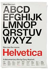
Helvetica
Film #42
THE PLOT
A documentary about typography, graphic design, and global visual culture.
Year 1, Day 41
BEFORE: How do I reward myself on this stormy Friday? By having my second double feature of the marathon. Sticking with the documentaries, today’s theme is all about design. Both films are directed by Gary Hustwit beginning with Helvetica. Most people probably know it as a font on their computer. This documentary goes in depth on that typeface. I can’t wait to learn more about one of the most ubiquitous typefaces in the world.
AFTER: The word I would use to describe this documentary is diverse. It covers, in great detail, both sides of the Helvetica spectrum: those who believe the typeface is clean and authoritative and those who believe it is boring and overused.
I was shocked with how commonplace Helvetica is. There are many clips in the documentary that show real world uses of the typeface on signs, posters, windows, and many other places. The many examples also visualize both sides of the argument being told. The best use of Helvetica is on command signs such as “Stop” or “Exit” or pretty much any street sign you see. It’s clean, simple, and to-the-point. But there were also many creative examples of the typeface by altering the spacing to create different looks. However, after seeing example after example, you start to see how it can be boring and repetitive. It got to the point where I thought, “Enough with the examples already. I get what Helvetica looks like, there’s no need to show me another ten street signs.”
I’m disappointed that they didn’t go further into how typefaces are designed. Some early design sketches of Helvetica and other typefaces are shown but the process of how one is created is fully detailed. There is a lot of type vocabulary that is alluded to (ascender, descender, baseline) but isn’t really explained fully which also left me less than satisfied.
For anyone who is into fonts and typefaces, Helvetica goes in depth into the creation and meaning behind several different typefaces with a main focus on the titular Helvetica. Anyone who couldn’t care less about what font they write their next paper in or use on the next presentation should probably skip this documentary.
RATING: 3 out of 5